I borrowed a friends Spyder2PRO to calibrate my monitor. The first time it came out definitely on the Magenta side ?! I calibrated to a gamma of 2.2 (6,500) ... which is usually considered the Standard, but Mac's seem to like 1.8 better. After three tries I finally got it to look ... I think ... neutral.
But a lot of other peoples photos look a bit dark on my monitor. It could be a deliberate choice by the other photographers. I traditionally have always liked my prints a bit on the light side.
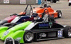
To me, the attached photo seems realistic for the bright sunny conditions. How does it look on your monitors?
Mako Koiwai wrote:I borrowed a friends Spyder2PRO to calibrate my monitor. The first time it came out definitely on the Magenta side ?! I calibrated to a gamma of 2.2 (6,500) ... which is usually considered the Standard, but Mac's seem to like 1.8 better. After three tries I finally got it to look ... I think ... neutral.
But a lot of other peoples photos look a bit dark on my monitor. It could be a deliberate choice by the other photographers. I traditionally have always liked my prints a bit on the light side.
To me, the attached photo seems realistic for the bright sunny conditions. How does it look on your monitors?
Looks great to me, but I don't know much about photography.
==============
Oversteer is better than understeer because you don't see the tree you're hitting.
Larry's files ... or his shot of our Miata (attached to my message above) that I made lighter to look "correct" on my monitor? His files look dark on my monitor. That could be a style choice of Larry's or it could be that my monitor is not bright enough.
I know nothing about photography but I think it looks great. I don't think it is too light but I think any lighter would be too much... but what do I know? The thing that pops out to me the most in that picture is the huge smile on my face What a great weekend!
I think the original looks better on my screen. I like the deeper colors, makes the cars appear more vibrant. Plus the ground doesn't look washed out as it does on my monitor in the brightened version Mako posted.
Nicole Nagler wrote:I think the original looks better on my screen. I like the deeper colors, makes the cars appear more vibrant. Plus the ground doesn't look washed out as it does on my monitor in the brightened version Mako posted.
Leonard Cachola wrote:I like Larry's version better. Mako's looks too bright on my monitor.
Mako's looks good until I see Larry's, then I can see the difference in contrast and color saturation. Mako's has more detail in the dark areas (duh) but Larry's is more vivid.
==============
Oversteer is better than understeer because you don't see the tree you're hitting.
well, mako doesn't have the raw file when he's dinking with the photo. but on the raw file, you can bump the exposure 1/3 to 2/3 stop, and bump the recovery to get something that's retains the colors, but recovers some of the shadow details.
Jeff,
Mako does have the raw file. I sent him all the raw files of his car.
Most of my photos are a little bit under exposed so I can bring it out later, but mostly because I want lots of natural vividness I don't want to just up the contrast later in photoshop and lose information in the photo. That one of Mako's Miata is strait off the camera but resized.
Here are some shots from last nights X-men Origins premiere. Under exposed at first to maintain high shutter speed (around the 1/500th range) and great color but I brought out the curves later. These are resized but not cropped!
Something between the two would be best. The original loses a lot in the shadows (faces, etc) but Mako's version is too bright in the highlights. Actually Mako's version makes me want to squint like I would if I was standing there in bright sunlight watching the run. So that makes Mako's more accurate, right? ;)
Yeahhhh ! Plus 1 for realistic bright day at El Toro!
But for most pictorial stuff I DO LIKE saturated and dramatic.
Larry, interesting that you're underexposing slightly ... I've been reminded by a number of folks that it's better to give more exposure in Digital ... instead of treating digital like transparency film. With transparency film, overexposure leads to loss of detail, but in the digital world ... there is MORE info in the highlight areas ... but yes, you don't want to go so far that you lose detail:
Mako Koiwai wrote:Yeahhhh ! Plus 1 for realistic bright day at El Toro!
But for most pictorial stuff I DO LIKE saturated and dramatic.
Larry, interesting that you're underexposing slightly ... I've been reminded by a number of folks that it's better to give more exposure in Digital ... instead of treating digital like transparency film. With transparency film, overexposure leads to loss of detail, but in the digital world ... there is MORE info in the highlight areas ... but yes, you don't want to go so far that you lose detail:
I have been hearing a lot of that! but producing images on the out in the field every day has taught me to under expose everything! even if there is a chance for over exposure I get yelled at because they just can't bring it back! Its sad when someone next to me shows me a photo of someone we both shot and all i can see are the two nose holes but no nose.
For example, I will show it to you later on but I shot through a tinted car when Rhianna was starting to come out again after her wounds healed. The photo was black! It looked like i took a photo with the lens cap on. But after I maxed out the curves in photoshop I could see Rhianna! So i submitted the photo and they used it! That would not have happened if it was really really overexposed!
I hear you ... but lately I've been trying to make sure I get my exposure a bit more to the right. I understand ... you can't take a chance. Your Work looks fabulous ... so why change. I would imagine your large sensor helps with more dynamic range. The newer cameras are using more processing to insure high light and shadow detail.